
Start Here
Everything you need to design dark mode interfaces that work
Why Dark Mode Matters
Essential design principles for evening browsing and reduced eye strain
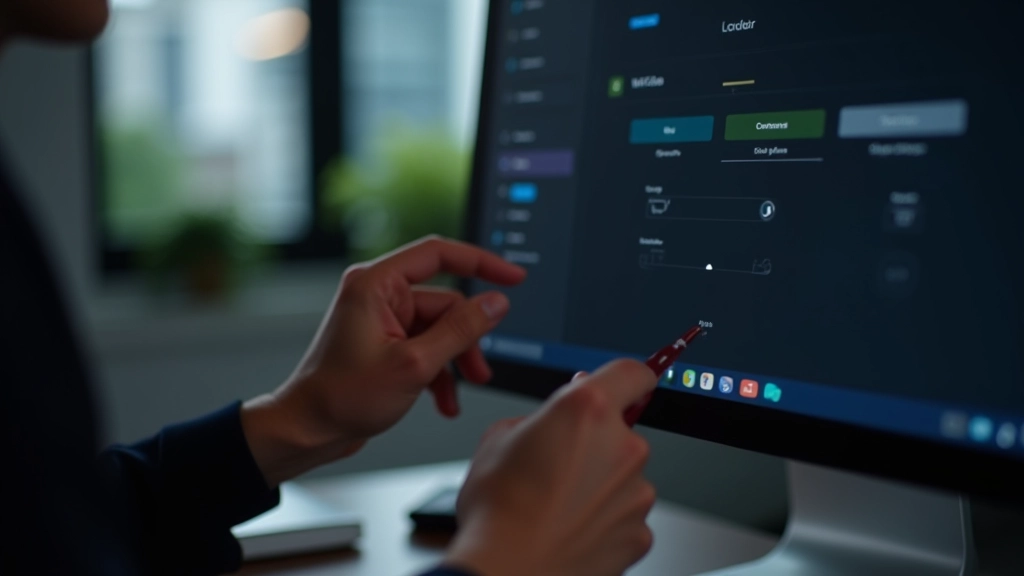
Contrast Management
Balancing text and accent colors ensures readability without overwhelming users at night
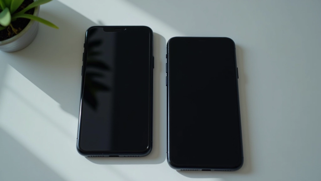
Cross-Device Consistency
Dark mode looks the same whether users browse on phones, tablets, or desktop screens

Accessibility First
Meeting WCAG contrast standards means your dark mode works for everyone
Design Principles
Four pillars of effective dark mode design
Eye Comfort
Fine Tuning
Testing
User Choice
What Designers Say
Real experiences implementing dark mode across Singapore projects
“We weren’t sure how much dark mode would matter until we launched it. Users are checking the site at night now and they’re staying longer. The feedback’s been really positive about eye strain reduction.”
“The contrast testing took longer than expected, but it’s worth it. Now our site passes WCAG standards in both modes. That’s something we’re actually proud to show clients.”
“Dark mode wasn’t just slapping a dark background on everything. It’s a complete redesign of the color system. Once we got that right, the toggle switch felt natural and users don’t complain about color inconsistencies anymore.”

Built by Designers for Designers
We understand the challenges of designing dark mode. We’ve worked with teams across Singapore to solve real problems — from contrast testing to toggle switch implementation.
Rahul — Color Systems Specialist
Sophie — Accessibility Expert
Chen — Frontend Architecture
Amara — User Research & Testing
We’re here to help your team implement dark mode properly.
The Impact of Proper Dark Mode
What happens when you design dark mode the right way
Average session duration (evening users)
Eye strain complaints in evening hours
WCAG contrast violations after testing
User preference persistence
Without vs With Proper Dark Mode
The difference between a quick dark theme and intentional design
Without Planning
With Dark Mode Design
Colors that look good in light mode fail in dark mode
Dedicated color system built for both modes from the start
Text contrast issues cause accessibility violations
WCAG AA standards met in both light and dark modes
Toggle switch breaks or loses user preference
Seamless switching with localStorage persistence
Testing only on one device or browser
Verified across Chrome, Safari, Firefox, Edge on mobile and desktop
Evening users abandon site due to eye strain
Comfortable for all times of day, longer session times
Featured Resources
In-depth guides on dark mode design for Singapore projects

Building Color Palettes That Work in Low Light
Learn how to select accent colors and backgrounds that maintain readability without causing eye fatigue when users browse at night.
Read Full Guide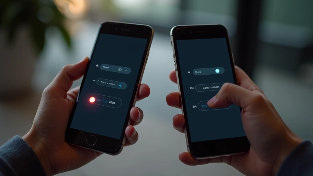

Ready to Design Dark Mode Right
Whether you’re starting from scratch or refining an existing dark mode, we’re here to help. Get in touch with our team to discuss your project.